Building your design system using React, Tailwind, storybook
26/12/2023 Wassim Nassour
Hey friends, today we will work on implementing the design system and creating reusable components throughout the application. But before we start diving into the technical side, let's first understand what a design system is.
What is a design system?
A design system is a set of reusable components, patterns, and guidelines that define a consistent look, feel, and behavior across an application. It includes typography, color palettes, spacing, and predefined reusable components such as buttons, forms, and navigation elements. and this can be helpful if we have those components shared across other applications via mono repo
Build a Reusable Button using React and Tailwind
In this guide, we will focus on creating a reusable button as example using React and Tailwind CSS. The same pattern can be applied to any component. We will be using React along with Tailwind CSS and
CVA package to define variants and styles for the button.while It's a common practice to provide numerous customization options in code, especially when creating reusable components. However, when these options are directly checked within the
className attribute, the codebase can become cluttered and difficult to maintain as it grows.import clsx from 'clsx'
import { PropsWithChildren } from 'react'
export interface Props extends PropsWithChildren {
intent?: 'primary' | 'secondary' | 'danger'
}
export function Button({ intent = 'primary', ...props }) {
return (
<button
className={clsx(
'flex items-center justify-center px-4 py-2 rounded font-medium focus:outline-none',
// Corrected class names by wrapping them in strings
'bg-brand-500 text-white', // Assuming these are valid class names
intent === 'primary' && 'bg-gray-200 text-gray-900 dark:bg-gray-700 dark:hover:bg-gray-600',
intent === 'secondary' &&
'bg-gray-200 text-gray-900 dark:bg-gray-700 dark:hover:bg-gray-600 dark:text-gray-100 focus:ring-gray-500',
intent === 'danger' && 'bg-red-500 text-white focus:ring-red-50' // Example of another class for danger intent
)}
{...props}
/>
)
}
As a solution for this, we will use the
cva package, which allows you to create and manage variants for your components.// install pa cva package
npm i class-variance-authority
example of our final code
import { cva, VariantProps } from 'class-variance-authority'
import { PropsWithChildren } from 'react'

const buttonStyles = cva(
  'flex relative items-center justify-center px-4 py-2 rounded font-medium focus:outline-none focus:ring-2 focus:ring-offset-white dark:focus:ring-offset-black focus:ring-offset-1 disabled:opacity-60 disabled:pointer-events-none hover:bg-opacity-80',
  {
    variants: {
      intent: {
        primary: 'bg-brand-500 text-black border',
        secondary:
          'bg-gray-200 text-gray-900 dark:bg-gray-700 dark:hover:bg-gray-600 dark:text-gray-100 focus:ring-gray-500',
        danger: 'bg-red-500 text-white focus:ring-red-500'
      },
      fullWidth: {
        true: 'w-64',
        false: 'w-24'
      }
    },
    defaultVariants: {
      intent: 'danger'
    },
    compoundVariants: [
      {
        intent: 'primary',
        fullWidth: false,
        class: 'bg-blue-400'
      },
      {
        intent: 'danger',
        fullWidth: true,
        class: 'text-6xl'
      }
    ]
  }
)

interface Props extends VariantProps<typeof buttonStyles>, PropsWithChildren {}

export function Button({ intent, fullWidth, ...props }: Props) {
  return <button className={buttonStyles({ intent, fullWidth })} {...props} />
}
let’s explore each piece of
buttonStyles //We have variants object containing two elements intent and fullWith
// 1 - intent is just custom tailwind styles
intent: {
primary: 'bg-brand-500 text-white',
secondary: 'bg-gray-200 text-gray-900 dark:bg-gray-700 dark:hover:bg-gray-600 dark:text-gray-100 focus:ring-gray-500',
danger: 'bg-red-500 text-white focus:ring-red-500',
},
// 2- and for fullwidth, it's like style with the condition if we provide fullWidth
//It will apply the one with true if not it will apply the style with false
fullWidth: {
true: 'w-full',
false: "w-10"
},
// 3- defaultVariants this is used to predefine the variants
defaultVariants: {
intent: 'primary',
},
//4 - compoundVariant, Variants that apply when multiple other variant conditions are met.
// as example here if intent ='primary' and fullWith=false , button will apply the 3
compoundVariants: [
{
intent: "primary",
fullWidth: false,
class: "bg-blue-400",
}
]
after creating our reusable button component we can use it like this
<Button intent="primary" fullWidth>
  Submit
</Button>
Publish the app to the storybook
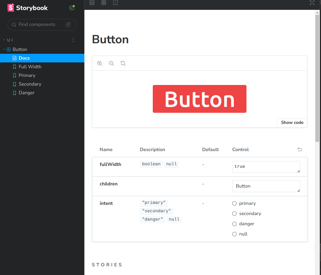
To showcase and document our reusable button component, we'll integrate it into Storybook, offering a comprehensive view of its various states and configurations.
installation can be found here
after installation and creating the Button Storty, you can run the storybook to see the component using
npm run storybookUpon running Storybook, navigate to the specified URL in your browser (usually
http://localhost:6006/), where you'll find the following stories for the button component:Button StoryBook component
import type { Meta, StoryObj } from '@storybook/react'

import { Button } from './button'

// More on how to set up stories at: <https://storybook.js.org/docs/writing-stories#default-export>
const meta = {
  // i used this title to create button under ui folder
  title: 'ui/Button',
  component: Button,
  parameters: {
    // Optional parameter to center the component in the Canvas. More info: <https://storybook.js.org/docs/configure/story-layout>
    layout: 'centered'
  },
  // This component will have an automatically generated Autodocs entry: <https://storybook.js.org/docs/writing-docs/autodocs>
  tags: ['autodocs']

  // More on argTypes: <https://storybook.js.org/docs/api/argtypes>
} satisfies Meta<typeof Button>

export default meta
type Story = StoryObj<typeof meta>

export const FullWidth: Story = {
  args: {
    fullWidth: true,
    children: 'Button'
  }
}

export const Primary: Story = {
  args: {
    intent: 'primary',
    children: 'Primary Button'
  }
}

export const Secondary: Story = {
  args: {
    intent: 'secondary',
    children: 'Secondary button'
  }
}

export const Danger: Story = {
  args: {
    intent: 'danger',
    children: 'Danger button'
  }
}
These stories provide a comprehensive representation of our button component across various configurations, aiding in documentation and visualizing its different states within the design system.

So that's our button! We learned to keep our code stylish but not messy by using
cva and Tailwind to boss our button styles.